
Medly iOS App
Patient-facing app for Medly Pharmacy
Overview
When I joined Medly in June 2021, the iOS team was perceived to be nearing the launch of a brand-new app, meant to replace the previous iOS app and interlock more seamlessly with other products and processes throughout the business.
In reality, we had a lot of work left to do. While most of the frontend had been built out, there was some oversight in terms of how things would actually work and no backend foundation established.
As a result, we had a handful of months to refine UX patterns and visual design as well as address new use cases and MVP shortcomings.


Visual Design, UX, Research
Mobile Team (US, Europe, India)
iOS
2021–2022
Overview
When I joined Medly in June 2021, the iOS team was perceived to be nearing the launch of a brand-new app, meant to replace the previous iOS app and interlock more seamlessly with other products and processes throughout the business.
In reality, we had a lot of work left to do. While most of the frontend had been built out, there was some oversight in terms of how things would actually work and no backend foundation established.
As a result, we had a handful of months to refine UX patterns and visual design as well as address new use cases and MVP shortcomings.
Visual Design, UX, Research
Mobile Team (US, Europe, India)
iOS
2021–2022
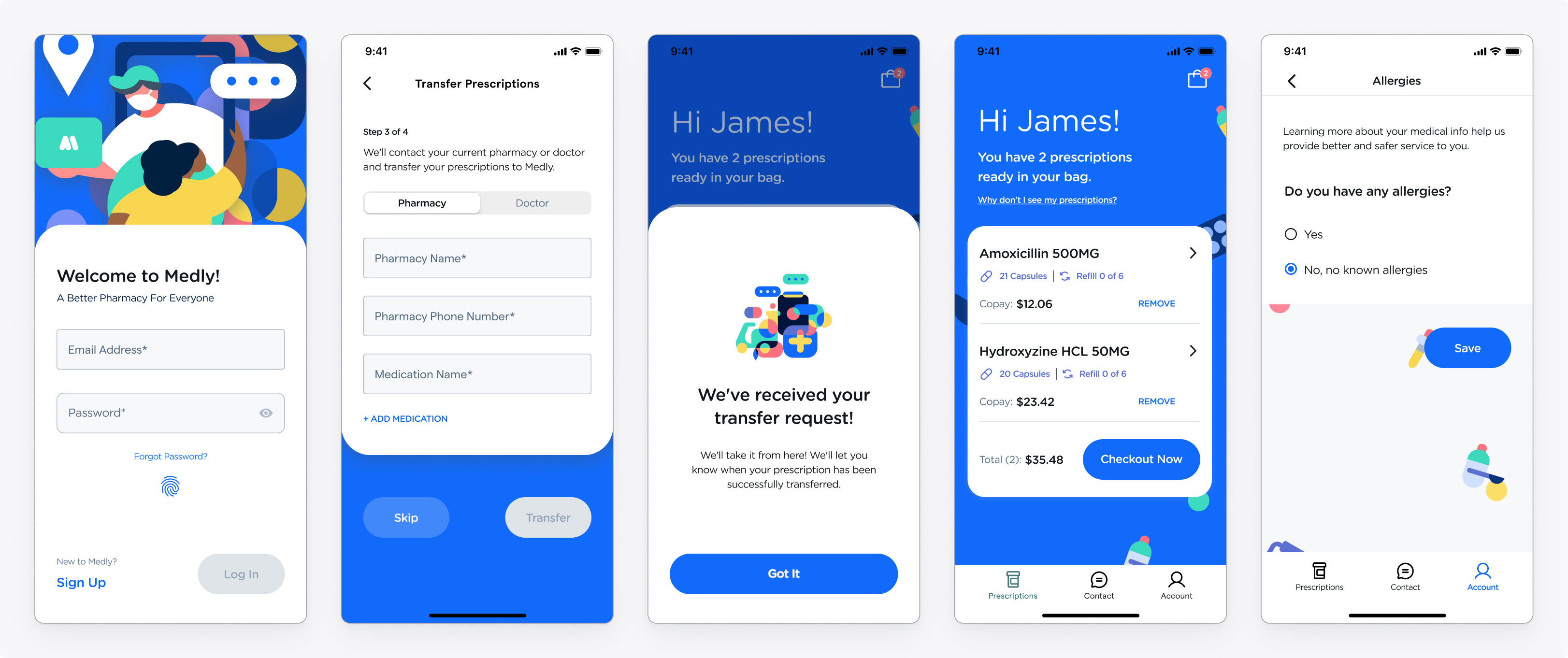
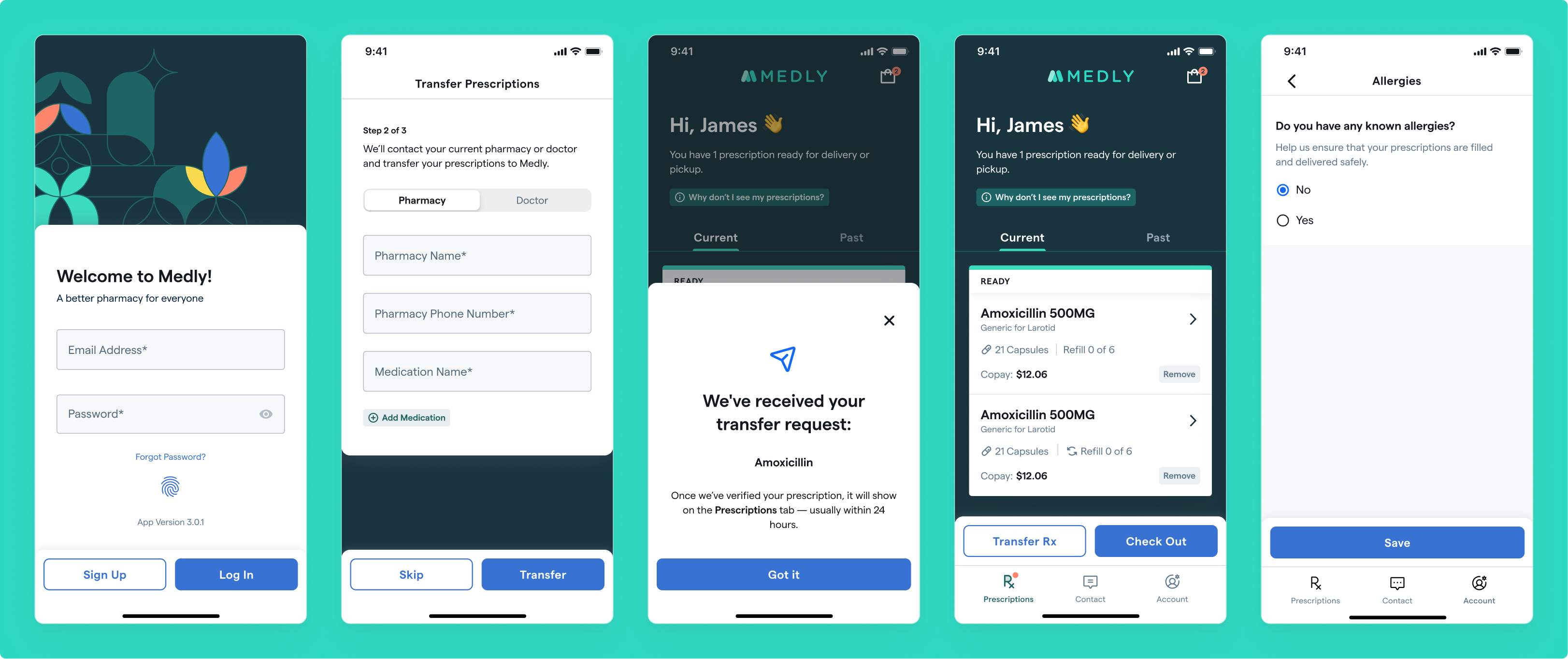
Before & After of some screens from when I joined vs. now.
Login / Transfer Prescriptions (Onboarding) / Transfer Confrimation / Prescriptions Tab / Allergies Info
Contributions
Consistent UX Patterns
Navigation
One of the first things I did after joining the team was establish alignment on navigational patterns. I'd noticed we had inconsistent uses of pages/sheets/pseudo-sheets/overlays/etc.
Documenting this led us to clean up our existing patterns throughout the app, and helped eliminate the guesswork about how we should present future screens and information. We still refer back to these guidelines and update them as necessary.
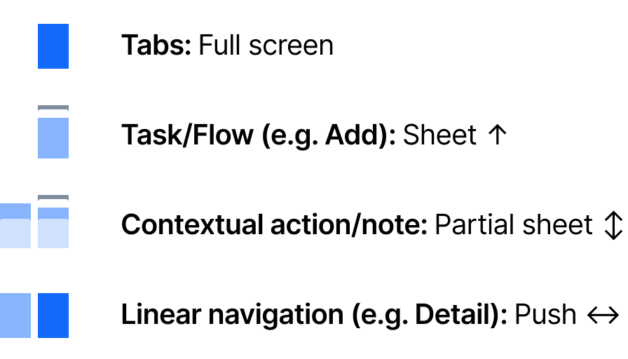
Working navigation paradigm
CTAs
Our primary and secondary actions didn't have a clear rhyme or reason for style or placement throughout the app. I made the case for an app-wide button refactor to make the placement and treatment more predictable and accessible to patients.
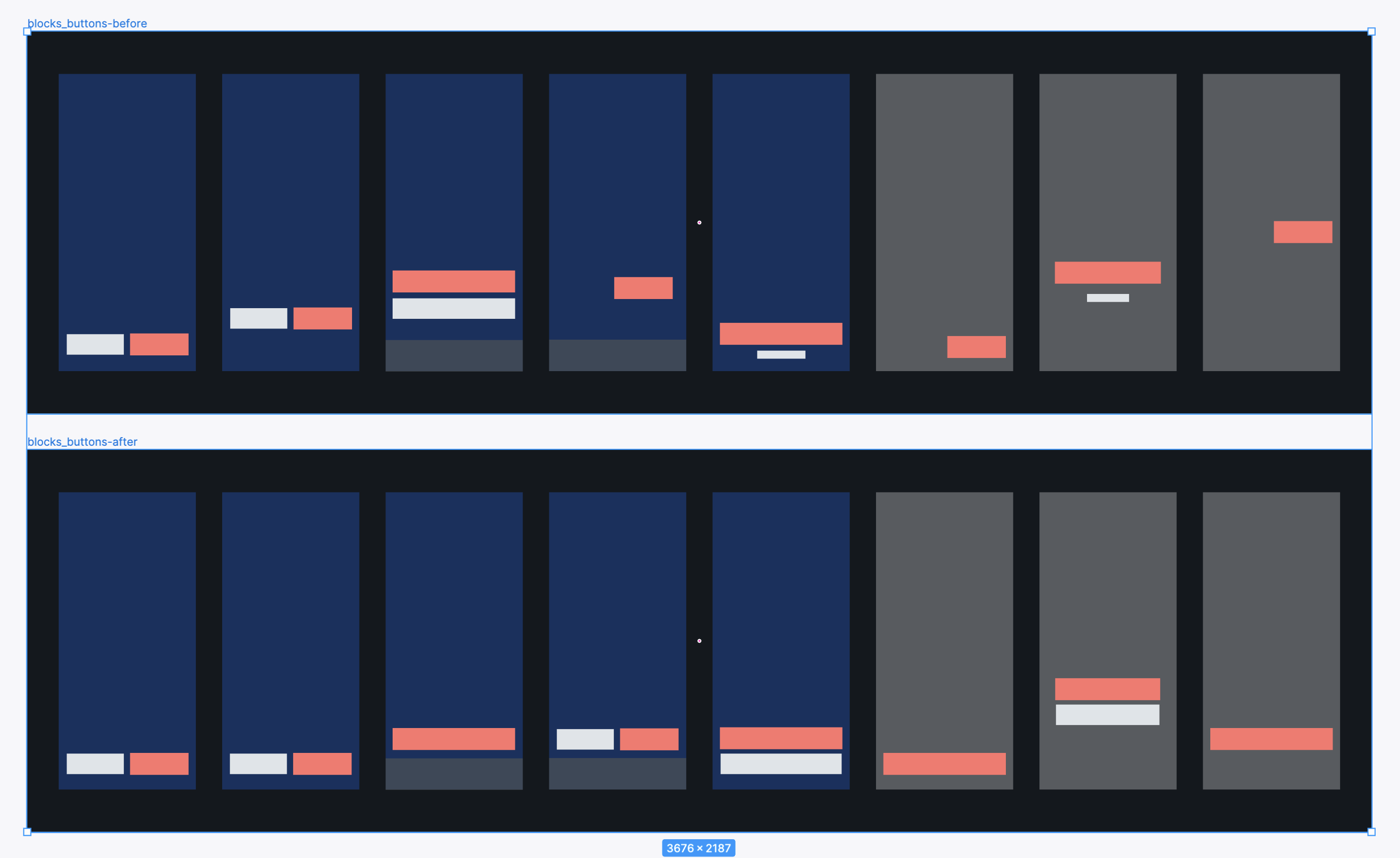
Simplified visual to communicate the problems with CTAs as they were and proposed updates
Brand Expression
In partnership with other B2C designers, I up-leveled our brand expression in the iOS app and helped establish patterns used across products. We worked collaboratively to define colors, typography, illustration treatments, and UI styles that help Medly come off as more mature and trustworthy, compared to what we felt was a little playful and kiddish before.
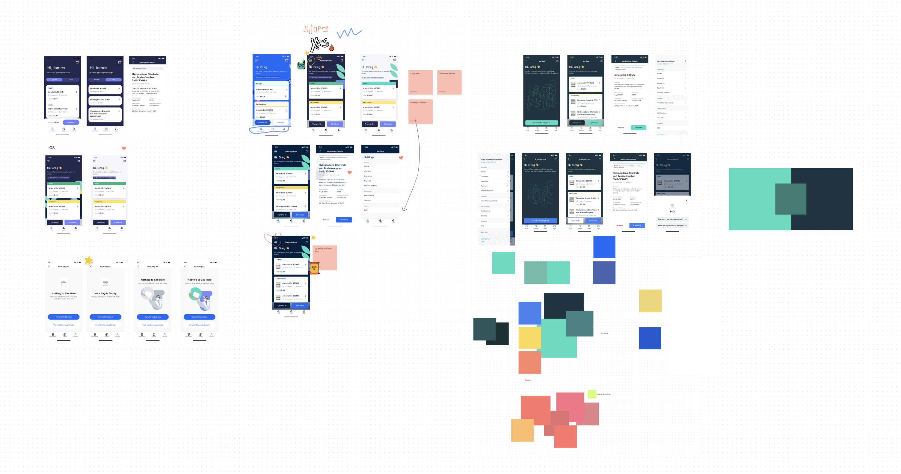
Some visual design exploration I did for the app
Research
In the interest of critically evaluating B2C priorities and approaches, I helped lead Medly's first direct-patient research. I worked with two other designers and UX research to plan, write scripts, interview patients, synthesize research, and present to the organization.
Prior to this, we were largely operating on assumptions and secondhand information from Patient Experience agents. It was refreshing (and challenging!) to hear from those working directly with our products, and invaluable to share out our findings.
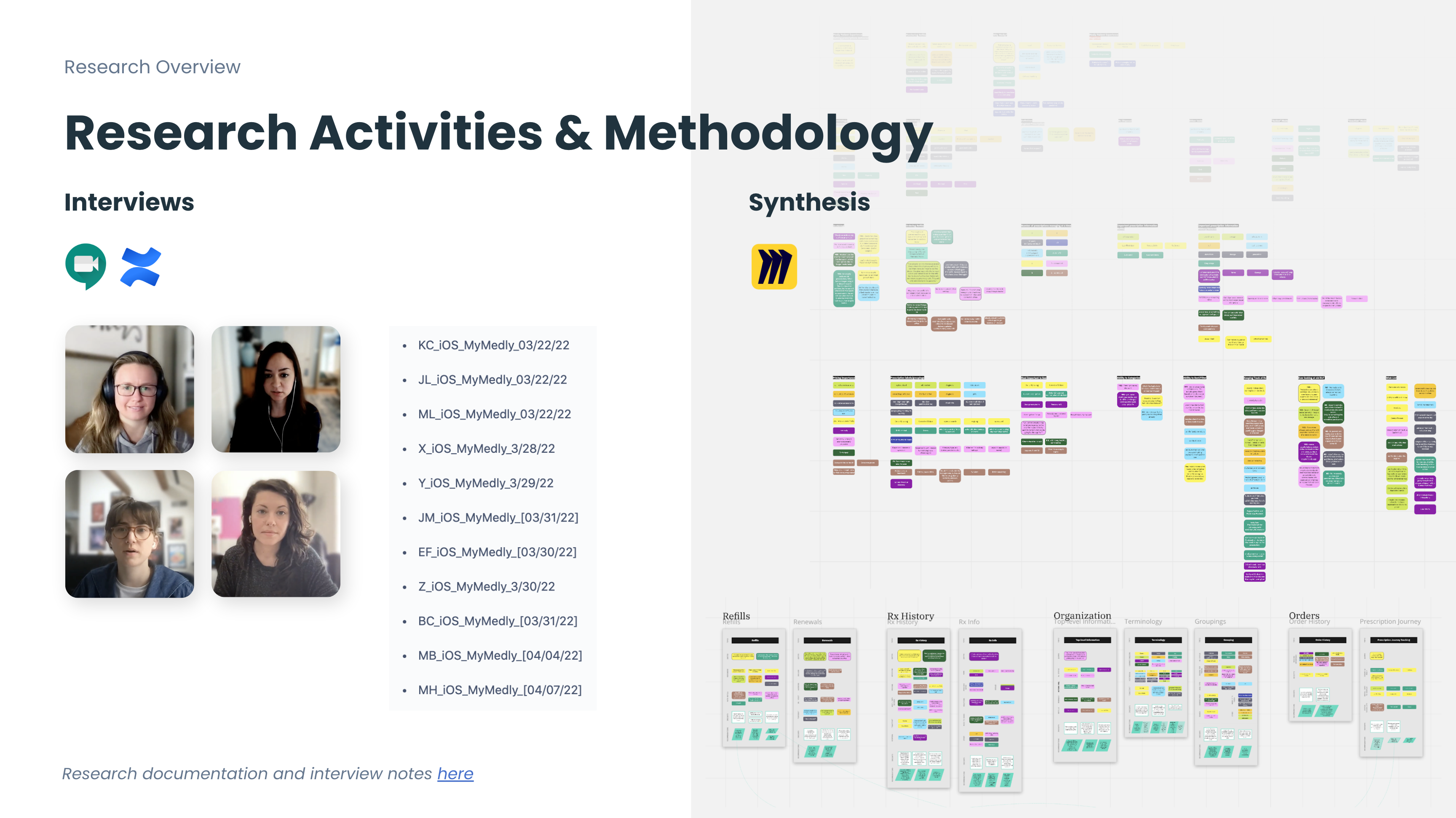
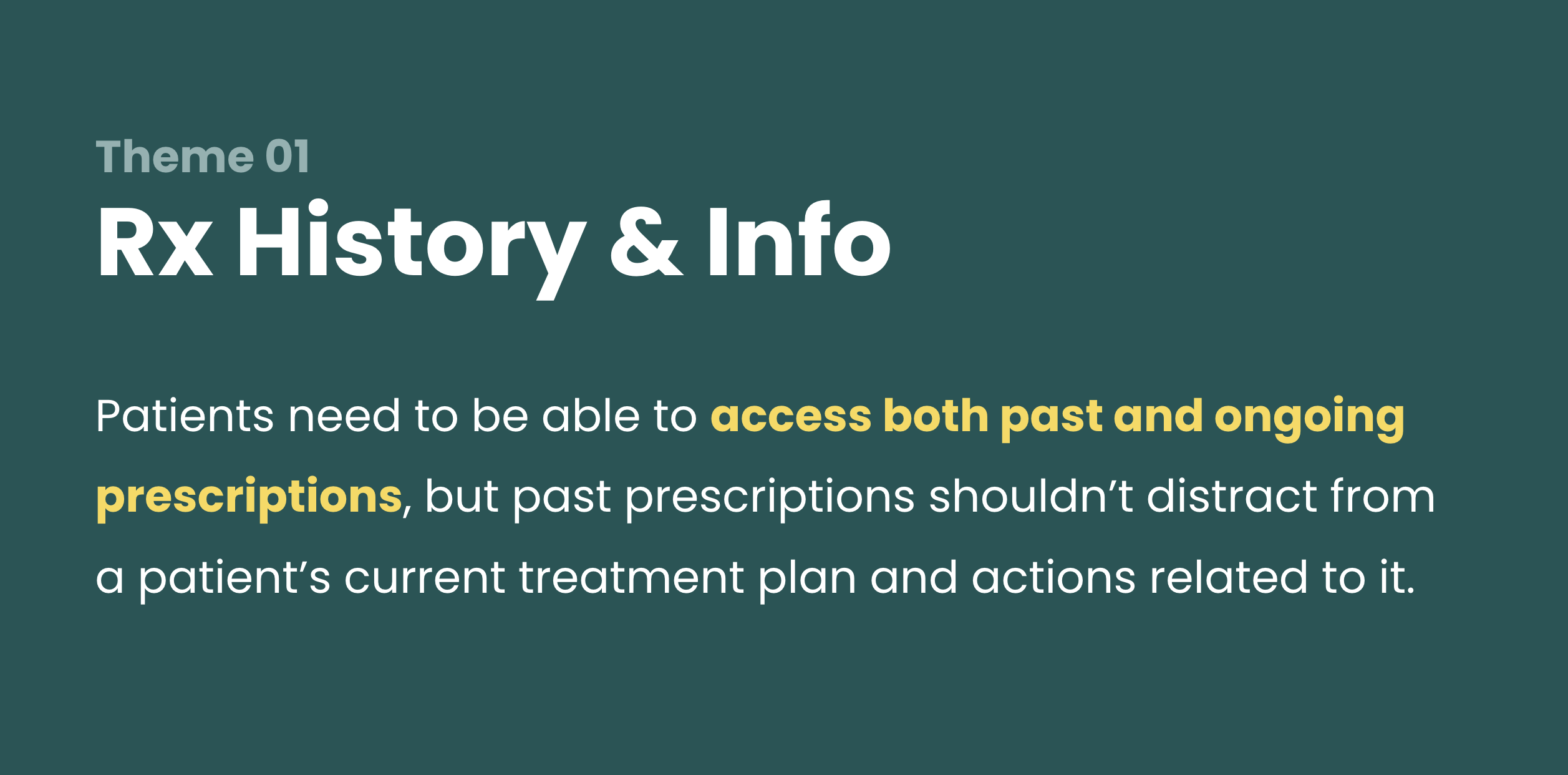
Some screenshots from our research presentation
Cross-Team Collaboration
When I joined Medly, many product squads were operating more or less in silos. I certainly can't take credit for the leaps and bounds of improvement I've seen with this over the past year, but I contributed where I could.
B2C
The iOS App has a web-based sibling in the works: MyMedly. I continuously pushed for better communication and collaboration between teams, from design to backend development, as we were frequently solving the same problems at different times. Now we have #b2c-specific Slack channels that help immensely with visibility and tag-teaming.
Cross-Business
Outside of the B2C world, visibility is even more opaque across products. My innate curiosity and systematic approach to problem-solving allowed me to connect the dots in some areas that may have otherwise been overlooked.
For example, the initial design for collecting patient allergies was an open text field. In conversation with a designer on our internal team, I learned that pharmacists have specific allergy codes that flag medications that may be dangerous to a patient. From there, I connected SDMs with one another to discuss how we might ensure that we're collecting allergies in a way that translates most helpfully for pharmacists.
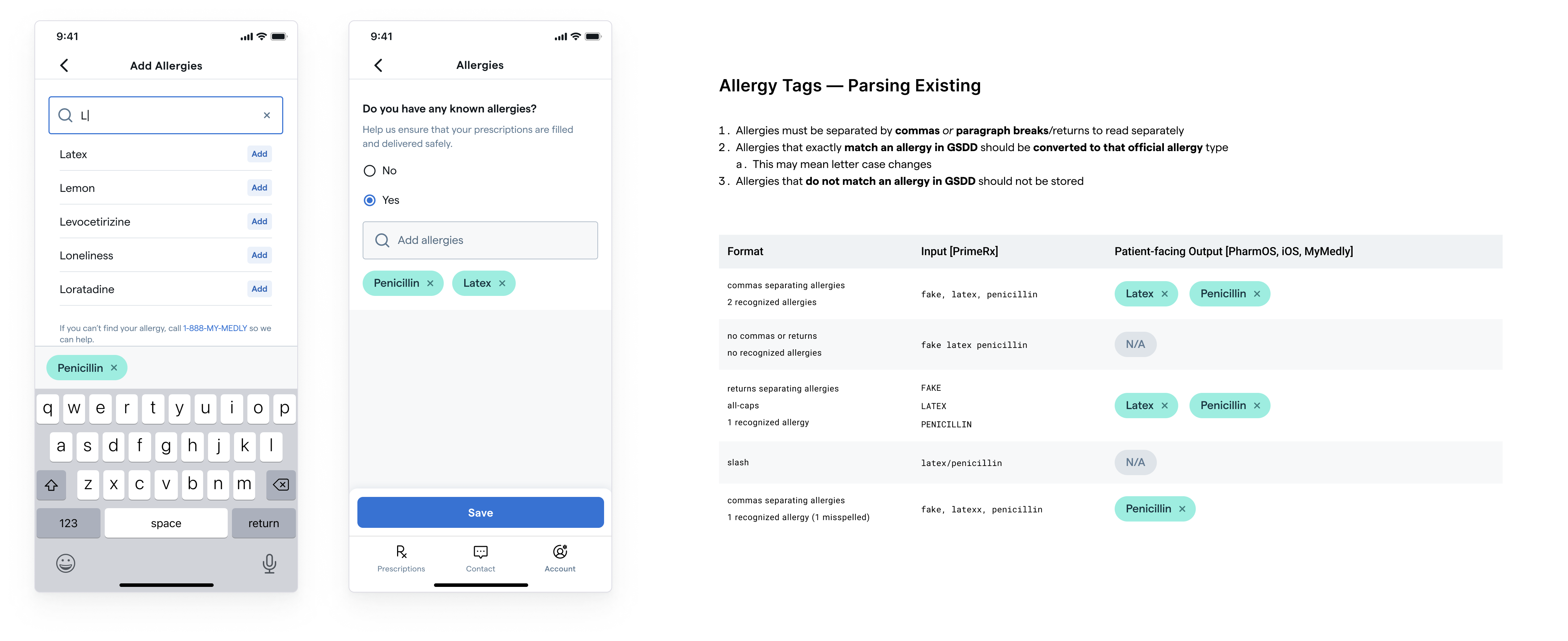
Add allergies patient flow; Considering how new and existing allergies are translated to help pharmacists.
We now pull from the same list of allergies that our internal tools use, which keeps our data clean and ensures that pharmacists pick up on any potentially-dangerous interactions.
Day-to-Day
- I've partnered closely with product and engineering to launch the app (Medly 3.0.0) in March, as well as to push updates and hot fixes addressing bugs, feedback, and new features thereafter (seven launches, so far!)
- I've aided with communication between tech and patient support agents by creating FAQs and monitoring Slack channels
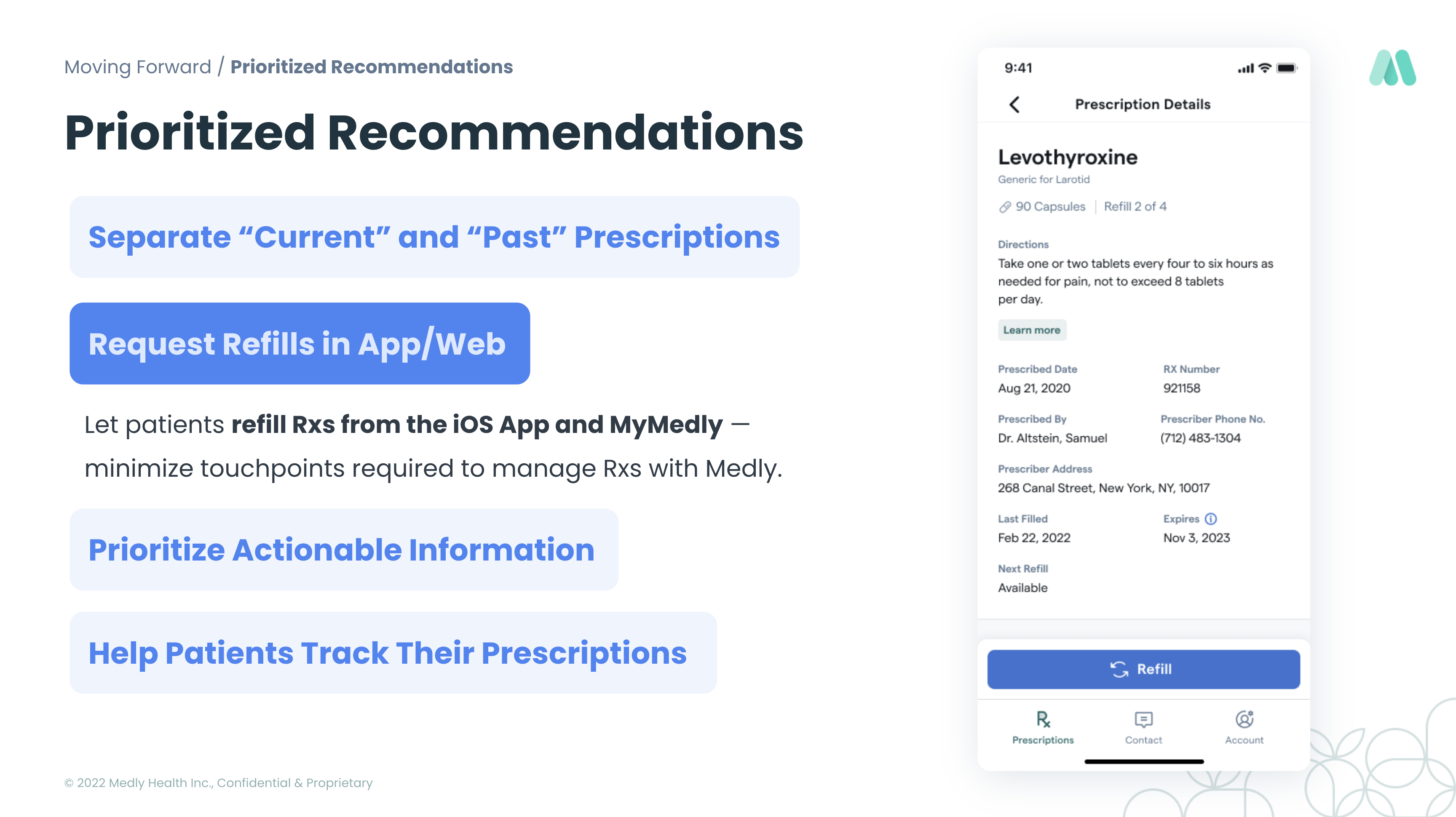
- I've designed new features, like Rx History, Refill Management, allergy collection, and expanded prescription information
Patients can now access information about both their current Rxs and those they used to take.
Let's connect
